Colorwash Me
How the Pantone Color of the Year contributes to overconsumption

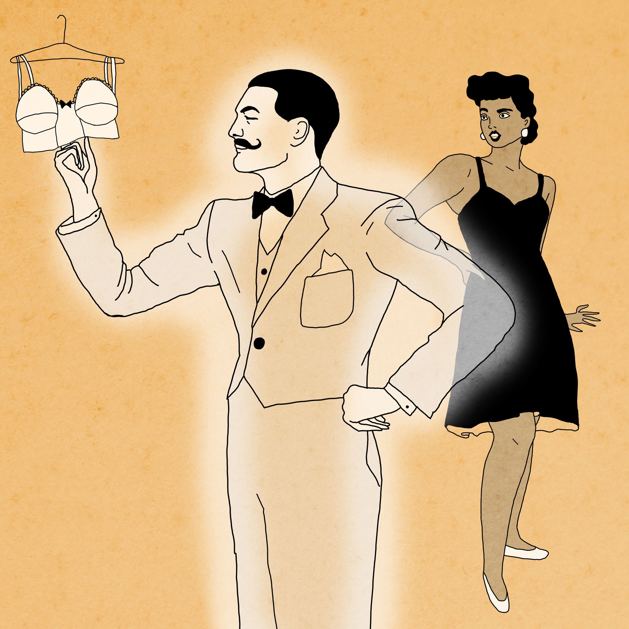
Illustrations by Rabbit Person Design
Instagram

MP Guillot, Editor in Chief Ungarbage Mag
Instagram
It’s 2005. I’m a 19 year old fashion design school graduate moving to Montreal for a four week internship. It feels like this is it: The life I always wanted is about to start. I get ready for my first day of work at a Canadian retailer, excited to take the subway for the first time but a little nervous of getting lost. I can’t shake off the image of a Kelly Cutrone-like boss who would make me cry in the first five minutes of my arrival. Am I ready for this?
I arrive and I’m given a tour of the office. The meet-and-greet isn’t even long enough for anyone to absorb my name. I’m shown to a small desk and given a shoe box full of Pantone swatches — those iconic 2 inch squares — and I’m told to put them back in their appropriate spots in the five or six massive swatch books that contain 1,867 different colours. “The last girl ended up classifying these swatches for a week!’’ my new boss’ assistant says.
I spend the day putting swatches back into these books and it never occurs to me that this color system has an impact on the way we consume things. I thought Pantone colors were just a system that helped manufacturers around the world understand each other better. I looked at trend books and I saw the color palettes, but I didn’t quite realize their power.

Fast forward 15 years and I’ve come to the realization that the fashion industry is not that glamorous or creative, especially with its contributions to environmental, ethical, and social problems. Many Pantone colors of the year have come and gone, and tons of 13-1520 Rose Quartz (Pantone Color of the Year 2016) clothes sit in landfills around the world.
How do Pantone colors impact the way we consume? To understand that, we have to examine our ability to be conditioned to like and to want: a psychological phenomenon studied by Robert Zajonc called “mere-exposure effect.” Research has shown that our positive response to something or someone is greatly linked to how much we’re exposed to that person or thing. The more we see the same things, the more we like them. Advertising companies have been using these techniques for years to make us buy different products and even to modify our idea of what is attractive. You only need to look at women’s body shapes over the decades to realize the impact. We’re constantly being fed new messages that shape our behavior and our idea of beauty.
Trend cycles are an effect of psychological conditioning on a societal scale. The more people see others wearing the same things, the more they seek those items too. Pantone colors play a part in conditioning us to buy what is currently trendy when companies choose yearly colors that will influence manufacturing in every industry. When Classic Blue 19-4052 was chosen in 2020 a wide range of products in this exact color entered the market: velvet couches, comfy knits, smooth ceramic tiles, cars, hair dyes, etc.
Suddenly, the blue clothes in our closets are not good enough. There’s something about those items that’s just not quite right. They’re not giving us the same emotional response as they used to because even though they are blue, they are not Classic Blue 19-4052. Off to the donation bin they go, and we find ourselves going back to the stores to buy replacements for the blue items we already owned.
As a former interior decorator, I’ve experienced first hand that color trends like those generated by Pantone and house paint brands have a direct impact on consumers' confidence in their own sense of style. Many clients take the new trends so seriously, as if they HAVE TO repaint their house because Benjamin Moore says that moss green is in style again. I always found myself saying, “Don’t watch decorating shows and don’t follow trends. Let’s guide you in discovering your own sense of style rather than going with what is ‘in’ right now. It will likely be ‘out’ in the next six months.”
While neutral color trends like beiges, grays, and whites have a longer lifespan, trendy colors (especially colors of the year) are often chosen to produce throw-away items. Cheap curtain panels, throw pillows, vases, decorative trinkets, candles, and other decor accessories are promoted to customers as affordable ways to enjoy trends. These items are the most likely to be made in unethical conditions with a heavy carbon footprint and they are most likely the first things to head off to the landfill when consumers get tired of them.

This idea of constantly changing color schemes creates tremendous by-product waste, particularly in the interior design industry. For example, flooring companies come out with new wood colors every three months and ask decorators to throw away the outdated samples. A gray option becomes a little more purple or a little more green, ensuring that it doesn’t match the gray flooring you installed three years ago. It pushes consumers to renovate all of their floors at once or risk ending up with mismatched rooms. If we think about it globally and consider all flooring showrooms around the world, the waste generated is significant. I’ve been to thousands of houses in my career and I’ve seen the impact of following color trends. A customer may want to redo one room in the latest colors and finishes, but the other rooms in the house reflect trends that have either already gone out of style or don’t work with the customer’s new direction. It’s a mess.
In short, Pantone’s Color of the Year facilitates unnecessary consumption. So, while we may get excited about the news of a new color and share it widely (an advertiser’s dream), we must find a way to enjoy novelty without unknowingly playing a part in propagating our conditioning to consume. We have to be more aware of our behaviors and question why we start to like or want new things. If we find ourselves coveting items that feature the new colors of the year, Pantone 17-5104 Ultimate Gray and Pantone 13-0647 Illuminating, let’s be curious about where these desires pop up. Do we suddenly crave a new yellow hat we don’t need? Maybe we can embrace the color from a creative place instead. We could use it in graphic design or in a painting, dye an existing shirt, or redirect our craving for that color towards something we really need to buy. For example, if you need a new notebook and there’s one in yellow and gray available, go for it! It’s an item with a short lifespan that you can recycle so you get to enjoy a trendy color without much long term impact.
At the end of the day, you can easily skip the color of the year train. Your style will be more original and timeless, you’ll save money and time, and avoid constantly thinking that you need something new to be happy. One trick I like to practice, from Lynne Twist’s book The Soul of Money, is to appreciate things without having to own them. It’s like going to the museum. You can look, but you don’t even think of bringing anything home. Trust me, it works. I was able to buy zero new items of clothing for an entire year, and even two years later, I’ve only purchased 6 new items.
Remember that discussing these topics is not meant to make ourselves feel bad for wanting things or demanding perfection (we should remove perfect from our vocabulary). It’s about understanding how trends are designed to brainwash us into shopping for our sense of happiness and self-worth. Capitalism’s intentions are to make the maximum amount of profit even at the expense of consumers’ mental health, the planet’s resources, and workers’ lives. Once we know this, it’s up to us to design a way of consuming that aligns with our values.
Want to contribute to the blog?
Keep Reading